
For my bad example of advertising, I chose a jar of Apple Jelly by the brand, Great Value. To me, this jar of apple jelly is not appealing at all. It is very bland and does not really stand out. The bread they used in the picture does not make me want to have an apple jelly sandwich... The symmetry in this add bothers me as well because it seems to be all over the place.... It's actually hard to pick things out in this product because there is nothing really on it but the brand, flavor and a picture of bread with jelly on it. Haha
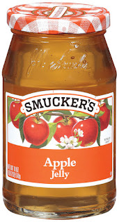
For my example of good advertising, I chose Smucker's Apple Jelly. To me, this looks much more inviting and appetizing. The lid reminds me of going on a picnic and gives it a more classy feel. The flavor on the label is easy to read and not overkill. The font of the brand suggest a quality product as well. It doesn't come across as cheesy or obnoxious. The apples in the picture go well with the lid because I feel like fresh apples and picnics go well together. I also like the symmetry and focal point of this label. everything flows and looks great.
No comments:
Post a Comment